Now I have to make a sad announcement. This will be my last post as a member of the Cupcake Inspirations Design Team. It's been quite a wonderful sweet and fun time for me. I've been on the team since February 13, 2011 and this is my 126th post, that's a lot of sweetness. I've had the pleasure of working with many wonderful teamies and we've been sponsored by many generous companies. I've been so lucky to get to work with the images they provided. My life has become a bit busier these days and keeping up with all the duties of a design team member has started to become difficult so it's time to step down and let someone else have some fun with the job.
 don't you just hate it when you can't get the colors to come out just right on your photo? Most of it looks OK but the background colors on the patterned paper and the blue card stocks just aren't reading right. It makes me crazy but what's a girl to do?
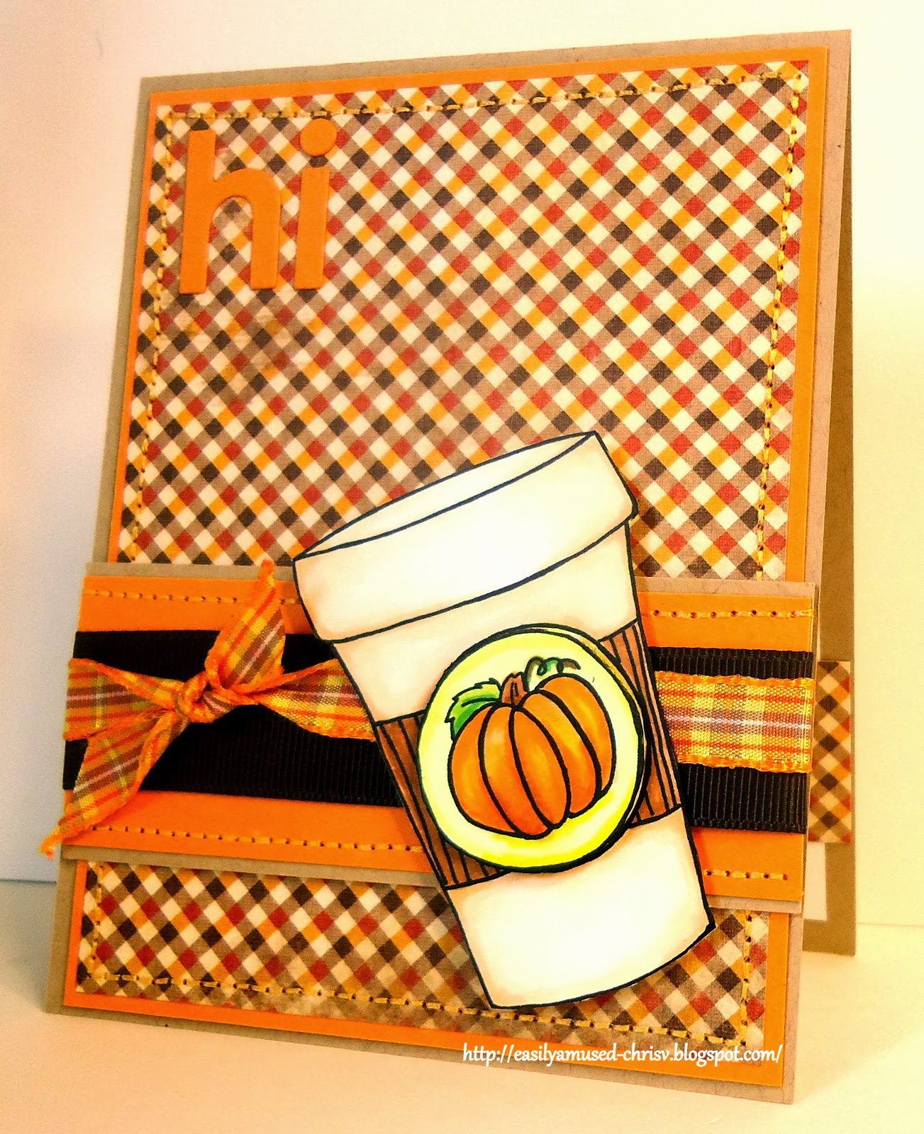
Here's the deets:
 stamp - Jellypark Friends "Jack Frost"
ink - printer
paper - My Favorite Things "Berrylicious", "Steel blue", "Razzleberry", "Pink Lemonade" and "Nighshift blue" card stock; Stampin' Up "whisper White" card stock; patterned paper unmarked
miscellaneous - copics; bling; Stampin' Up circle and scalloped circle punch; ek success circle punch; Jolees' snowflakes stickers
Here's the challenges:
Cupcake Inspirations CIC241 - photo
Freshly Made Sketches #116 - sketch
Friday Mash Up FM139 - Winter not Christmas
Simon Says - Let It Snow
Thanks for stopping by, please come back again.