Wednesday, September 30, 2009

Frustration


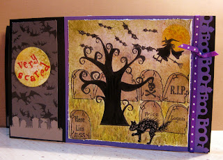
Frustration! Frustration is what you feel when you've spent a long time making a card that you didn't know where you were going with it when you started but by the end it was taking on a life of its own and looking awesome but you can't get a decent picture. It's the purple. I can never get purple to look right. I tried to adjust it but I just don't know how to get it right. The letters are embossed in red and that's not looking too good either. I know you should take the picture in daylight but I'm pretty much out of the house during the daylight hours. So you will have to take my word for it, the mat behind the graveyard and the ribbon are purple. There are
many layers of ink sponged, brushed and stamped all over this card. Seriously, this sucker took on a life of its own. When I started out I was trying to figure out what to do for the Macabre Monday Challenge #7 Menacing Movables. I've been playing along with the challenges on Haunted Design House since they started and didn't want to chicken out on this one. I remembered making a card like this one time at a Stampin' Up demonstration but didn't remember how it was done or what it was called and somehow I saw something about a "wiper card" and followed it to find the tutorial on Splitcoast Stampers by Beate Johns. That was serendipitous (I love that word). So I read the tutorial a couple times and decided I could do that. First I needed to pick a small but fun stamp for the pop up piece and decided to go with this ghostie. I'm not sure what kind of animal is under that sheet and I'm sure I don't want to know. The stamp is from the Inkadinkado Ghouls and Goblins" set. It's all cats, dogs and birds in Halloween attire and one is funnier or cuter than the other. Since I was using this silly creature, the card can go in the Secret Crafter Saturday Challenge #51 Animal Antics. A cat also ended up in the graveyard scene, but the ghostie definitely qualifies for antics.
For no particular reason I decided I was going to make a square scene for the front of the card. Not a thought out decision that ended up costing me lots of time and brain punishment when it came to laying out the card. First of all I had to adjust the measurements of the card because my stamp was bigger than the tutorials and when it came to changing the shape I chickened out so I had to fill up the rectangle which turned out looking okay in the end.
Now that square scene was a ton of fun to make. I got lost in it. I pulled out every Halloween stamp set I had. What a mess my little work surface became. I didn't use them all but I used a lot of different stamps. The tree which makes it work for the Tuesday Taggers Challenge to make a project that includes trees. Hopefully one big tree will be enough, cause I could have stuck a couple more little trees in there but opted to forgo them. After all it is a graveyard and I can vouch for the fact that there are many, many trees in that graveyard, at least the one that my dad sent me to and told me the grave I was looking for was under the big tree, granted the directions were a little more explicit but they weren't good enough to lead me to the grave his aunt was buried in under the big tree, but me and my buddy had a grand time visiting lots of graves under big trees. Since that day I have noted that every cemetery I've been to has many big trees. Vanessa and I crack up over that trip to this day and that was about 10 years ago, hey, I told you I'm easily amused. But I digress... as I was saying the tree and the bats are from the MFT "Too Cute to Spook" set. The headstones, words on the headstones, skull and crossbones, and cat are from the MFT "Ghoulish Label" set. The witch and the moon are from the SU "Home Is Where the Haunt Is" set. The letters are from MSE "Multi Retro". After I got it all stamped on MFT Perfect Panel paper I colored it in with copics. Then I sponged and brushed and distressed the paper. I used Ranger Tea Dye and Peeled Paint, SU Pumpkin Pie and Basic Gray. Memento Black for the images and Dandelion for the moon, I ringed the moon with a second color but don't remember what it was. I covered the bats and cat with gunmetal stickles and smeared orange distress stickles over the moon and later over the word circles which were stamped in Versamark and embossed with red powder. The embossing is for the ABC Challenge E is for Embossing. I should have embossed the tree too but I chickened out. The purple cs got punched with the EK Success Boo border punch and the gray cs on the bottom was punched with the Martha Stewart Graveyard border punch. The bat paper is SU and after I put that down I decided the panels needed something else and that was when I decided to put the sentiment there. You have no idea how many different ways I tried it out before I did the one you see. I really like the way they came out. The first ones I did were done in my own handwriting with blood drips but they didn't look as good as the idea was.
So you got to read most of how this card took shape and follow my process. Some days the cards are planned before I start them and some days like today they unfold and it's really satisfying when they turn out this good, but frustrating when you can't get a decent picture to show it off. Oh well...
I hope you enjoyed your visit and would love for you to come back. I love to read your comments so please leave a note but most important of all is to go click on the pink ribbon.


Monday, September 28, 2009

Get Well Kitty


Do you know the Cat's Pajamas? They are a line of cute stamps and there's a Tuesday Challenge. You don't have to have a Cat's Pajama stamp to join in so if you're looking for a challenge on Tuesdays go check them out. This week is a color challenge to use Black, Melon Pink and Pumpkin. One of the things that I love about doing the challenge is that on Monday there's a slide show of all the cards that were submitted. I'm afraid I may a little late to get this posted on Holey Moley Monday but I'm gonna give it a try.
I used the Crazy for Challenges Sketch Challenge C4C4. I can't believe that they're already on their fourth week. They've got a terrific talented team over there and every week they've had a great sketch. Go check them out.
Well, it's late Sunday night and I've got to work in the morning so I'm gonna run.

Sunday, September 27, 2009

Howl Pretty are Butterflies?


On a one to ten I'd say these butterflies are a solid ten. The designers at Inkadinkado have made a gorgeous stamp set called "Patterned Bugs". I just love the name of this company, every time I see it I grin. They make some great stamps too.
This week the howling crew at Midnight Madness came up with a wicked challenge. I think they get harder and harder every week. I'm not sure if that's a good thing but it does make me think. I've been told I'm dangerous when I think, hmmm.
So the Midnight Madness sketch had a long thin top panel. I suppose I could have stamped an image a couple times in a column but I have a couple stamps sets from Inkadinkado that have long stamps and some of them haven't seen the dark of ink yet. This is one of them. I got this set of stamps specifically to go with this paper collection, Chocolat, from S.E.I. which is one of my favorite papers of all time. It's pink and brown and has sparkles on it.
Ink - Versamark Pink Petunia (with clear embossing powder)
Punch - Martha Stewart Arch Lattice border punch
I hope you enjoyed your visit and will come back again soon.

Autumn's Beauty

The thing that I love about Autumn is color. The colors are gorgeous, there are views in the mountains that take your breath away. Even if you don't go leaf peeping if you're out anywhere around here you can't help but stop to take in the sights of Fall. There are pumpkins and cornstalks decorating houses and businesses. The trees are changing colors, the leaves are falling and covering lawns, people are playing in the piles of leaves.
This weekend I found three challenges that have Fall in mind. Fashionista Friday #4 on If The Shoe Fits is fall themed and must have leaves. Over at No Time To Stamp Stamp Simply #106 is Rich Autumn Leaves and the Allsorts Week 20 Challenge to Get Inspired by Fall. My Favorite Things, My Favorite Challenge #18 is Get Buttoned Up and I just happened to have some great leaf buttons to use so I pulled out the "Falling For You" stamp set to use for this card. The Paper Cutz #10 Challenge is to use at least three buttons and I think three buttons is the right amount for this card, no more, no less. On LaLaLand Challenge #6 is paper piecing. MFT stamps and paper piecing go together perfectly so all I needed was a sketch and the one that the Fresh Batch Stamps and Smiles posted on Thursday was great for this stamp.
I rarely make cards that aren't rectangular or square so for me this is a fun departure, thanks to Stamps and Smiles for getting me onto a different track.
Enjoy the fall, you know what's coming...Oh, and don't forget to click on the pink ribbon.

Thursday, September 24, 2009

One More Before and After


It's getting late but a few posts back I promised to show you one more before and after. I had posted this card on the Splitcoast gallery for the 100MFTSKETCHES Challenge and thought I had finished it but after I posted it I thought it looked kind of blah and decided to go back to it and do something to jazz it up a little. For this card I added some stickles to the chamomile flowers and the Fleur de Lis on the pot. Under the word "Chamomile" I put three teeny weeny Recollections Rhinestone stickers and then in the corners of the top rectangle layer.
The papers are from DCWV "Nana's Nursery Baby Girl" pad. To echo the Fleur de Lis on the flower pot I used the EK Success border punch on the side of the striped paper.
I don't know if you'll agree with me or not but I think those simple little additions really make a difference.
Thanks for stopping by to visit. You all make my day!

It's number 100!


It's no secret that I love My Favorite Things. As soon as I saw those headless "Who's That Girl" stamps I was hooked. It took me awhile to decide which set to buy because I liked each and every one the store had for sale. Sometime after that I saw a card in the gallery at Splitcoast and then I found the MFT Forum. What a find that was. The women on the design team are extremely talented and so are the women who play along with the challenges. The cards and projects are exceptional but the best part is that they share their knowledge and experience and they like to laugh while doing it. Anybody can join in the at any time and will be welcomed. And if you're not too sure about the headless women there are lots of other stamps to choose from.
This week the 100th sketch challenge was posted. There are two very talented women who have worked very hard on the sketch challenges. They are Cindy Haffner and Frances Bryne aka Stamp Owl. If you click on their names you'll go to their blogs. They've always got something new to show you. You will not be disappointed.
Another challenge I follow is the Color Throwdown. This week they went a little wild with their challenge #61 to use olive, rose red, chocolate, mustard and regal rose. Well, that's a lot of colors so when I was picking a stamp to use for the sketch I wanted something that would allow me to use lots of colors so I picked the MFT "Say Charge" set. With three dressed up women there was plenty of places to use all those colors and I did it! Woohoo! I used SU markers so that I could pull those colors and then I picked some papers to go with it. I think the new Basic Grey "Indian Summer " collection has gorgeous papers and I picked the Maple Sugar and Woodrose papers for the card. I sponged around the edges of the image with Ranger distress Peeled Paint and affixed three MFT hot fix crystals at the top. I used the EK Success Moroccan Lace border punch on SU Regal Rose cs so this card is also good for the Pile It On Challenge #16 Crazed and Punched and the Paper Make Up Stamps challenge to use punches.
Congratulations and many thanks to Cindy and Frances and all the folks at MFT.

Jinx's Brew


Have you noticed that there are a bunch of challenges listed in my sidebar? I look forward to each and every one of them and several more that I have haven't stopped to take the time to put up there. On Thursday I look forward to Shirley's 2 Girls Twisted Thursday Sketch Challenge. This week I was really excited because earlier this week I received my first stamps from S2G and was ready to use the Jinx's brew set. So I got the sketch and checked to see which card won last week's challenge but at that time the winner hadn't been posted. So this afternoon when I got an e-mail telling me I won I was thrilled and I gotta tell you that it's still really fun to go to the winner's page and see my card, you can click here to see it. So enough patting myself on my back and onto this week's card.
The S2G #26 sketch challenge's twist this week is to put the word "boo" on your card. That's not too difficult to do this time of year. I just found my EK Success punch with the word "boo" and the ghost on it and punched it out on some black card stock.
The Haunted Design House Macabre Monday Challenge #6 is "perplexing pigment play". Translation - use black, white, orange, chartreuse green and purple. When you make a Halloween card that's pretty much the color theme so I pulled out my K & Co. Halloween Specialty paper pad and pulled out the polka dotted paper and the swirled paper and used those colors on the stamped image. It doesn't show very well but Jinx's skin is a lovely shade of lavender, she takes excellent care to stay out of direct sunlight, when she goes out during the day the brim of her hat usually keeps her safe but just in case she's brewing up some sun block with an spf30 in that cauldron. I used copics to color it in and then covered her dress with distress stickles and the bubbles with regular stickles.
The Pile It On #16 Challenge is "Crazed and Punched" and the theme over at Pile It On is to combine their challenge with at least one other challenge. The Paper Make Up Stamps Challenge is also to use punches, nesties don't count, you can use them but you have to use a punch for the challenge.
I hope you enjoyed your visit, and before you go remember to click on the pink ribbon. There's lots of events going on this time of year to support Breast Cancer research. If you can spare some cash make a donation. If you have the time join in a walk or a run. Wear your pink ribbons and think positive thoughts. We will overcome this disease!

Woof Woof Woof is a Winner

Today I've been dragging and feeling blah so the best medicine in the world came in the form of an e-mail advising me that Woof Woof Woof was the winner of the S2G, that's Shirley's 2 Girls sketch challenge #25 and what is even cooler is that they have a page for the winners and if you click on the purple text it'll take you there. I really needed the lift of seeing that page. So thanks to all you at S2G you made my day.
If you haven't visited S2G yet you should get over there. It's a really fun girly (but not yukky girly) place. You can shop or find a sketch challenge or join in a chat forum or watch a slide show of cards.

Tuesday, September 22, 2009

Before and After

A couple posts back I showed you a card that went through two revisions. Well, that seems to be what's going on for me a lot lately. Sometimes things go easy-breezy and the process just flows, the cards come out beautiful without thinking about it and other times it doesn't come easily, in fact, it's like pulling teeth. I have three cards that I made over the weekend and uploaded to my Splitcoast gallery. They were all made for the 100 MFT Sketches challenge. I might not have even bothered to put them on the blog but I thought that you might like to see that you aren't the only one who has to struggle. As I was writing them up I decided that I wasn't happy with any of them. I guess the point of this is to say that the card is never really finished until you put it in the mail or hand it to your friend. If you aren't satisfied with it put it aside for awhile and go back to it with a clear head and see what happens. When I got home from work I pulled the cards out and did just that. I thought that this card didn't have any jazz. I liked the paper choices and the stamping but it just didn't have anything that made it pop. In fact that's how I felt about all three cards. I liked them all but they needed something to make them pop. For this card all I did was add four little light blue Crystal Stickers Pearls. For me this little addition made a big difference. Sombetimes it just takes a little tweak. The papers for this card are from the Crate Paper "Prudence" collection. The stamps are from the MFT "Hot Stuff" set. The border punch is EK Success "Moroccan Lace". For the coffee beans nestibilities were used to cut it and the mat out.
The next card is for the If the Shoe Fits challenge to use lime green, white, black and white polka dots. That's a fun color combination. It was fun to make the card and I did like it. The green gives it a very cheerful feeling, I need to remember this next time I'm trying to come up with a get well card. I used another MFT sketch for the layout and between the layout and the colors I thought the card looked pretty good in its before state. But again, for me it needed something to make it pop. It already had a couple hot fix crystals on the sentiment area so I didn't want to put pearls or any more crystals on it. It was the stamped area that needed a little something more and as it turns out it was pretty easy to fix. I got out my stickles and as my buddy Eileen would tell me, everything looks better with stickles. I think she's right, definitely this card looks better with them. I covered the icing on the cake, the candle flames and the polka dots on the dress. It made a big difference to me.
For this card the paper is from the Making Memories "Black and White" pack. The candles were made with the EK Success "Candles" border punch. Copics were used to color in the stamped image. Nestibilities were used to punch out the circles.
I have one more card with a before and after story but it's very late and I'm too tired to post it now so tomorrow I'll have another before and after to share with you. If you enjoyed reading this come back to see the last one.
If you have time leave me a comment and let me know what you think. Were the cards fine the way they were? Do you like them better now?

A Kitty Bag in a Box


I wish I had a cute little story to start with but nothing funny or pithy is coming to me to I will get right down to the project.
This week the challenge on Project Tuesday is to make a Box in a Bag. I've wanted to make one of these for awhile but didn't get around to it until tonight. If you want to make one of these and need instructions click here for a link to the Splitcoast tutorial. The Project Tuesday challenges are supposed to take about 20 minutes. I think if you have everything ready to go, meaning you know what paper you want to use and what embellishments you are going to use that it will probably take about that amount of time. The tag is not part of the project so that took a little more time.
The argyle paper is from the Making Memories "Simply Fabulous" Collection. The pink card stock is from My Favorites Things. The kitty is stamp is from The Cat's Pajamas. I colored the image in with copics and gave her little tiny green bling eyes. The cats on the punched circles were made with an EK Success punch.
Depending on the paper and embellishments you chose it would be good for any holiday or birthday. It would be nice holder for candy, a gift card, jewelry or a combination of all three of them.
Thanks for stopping by, I hope you'll come back again. Don't forget to click on the pink ribbon.

Monday, September 21, 2009

They Can't All Be Bell Ringers


For this post I'm going to do something a little bit different. I'm showing you two cards that after I finished making I took apart. Actually they are the same card but each time I finished I just didn't like them. I made them using the MFT sketch #71. I was trying to make them conform to the Bizzy Bec's Createalicious Challenge #2 to make something using pink or plum, burgundy and green and to also add some lace, ribbon or fibre. It's the lace that
always get me hung up. I have lots of lace and I love the way it looks when you get it right but for some reason I just don't seem to be getting it right. If you want to see some cards where the lace looks great you should go to Melody's blog, A Paper Melody. I've had the pleasure of getting to know Melody on Splitcoast Stampers through the My Favorite Things forum and challenges. She's very talented and creative. She does fantastic work, frequently using lace and it always look spot on. She's got lots of projects if you're looking for some gift ideas for the holidays. If you go for a look you won't be disappointed.
You know the expression, "if at first you don't succeed, try, try, again". Well, I tried to fix this card twice. There's also the expression, "Three strikes and you're out." Well here's my third try. I'm still not crazy about it but I it's okay. For this card I stamped the images on white card stock and paper pieced the dress and mug with SU DSP Branbury. Besides not liking the way that lace looked the cup looked funky, so I made another cup, this time paper piecing only the outside part of the cup and coloring the inside part with copics. You probably have to click on the first two cards to enlarge them if you want to see the difference.
The punches used were Martha Stewart "Floral Lace" and EK Success "Moroccan Lace". Maybe I should have counted that as lace. The corners are a Cuttlebug die and there's some pink bling on the punched borders.
I'm still discontent and before I send it or give it I will probably rip the lace off completely. Well, like I said, they can't all be bell ringers.

Sunday, September 20, 2009

Woof, Woof, Woof


Woof, woof, woof is dog talk for "trick or treat". This stamp reminds me of my last dog, Dexter. We adopted him when his previous owner was going to put him down because of his impending divorce. My brother and his wife had a dog grooming business. Dexter had been going there for years and one day his owner told my brother that he would have to put Dexter down because he had no place to keep the dog and his soon to be ex hated the dog. Dexter loved my brother and my brother liked him enough to ask me if I knew anyone who could take the dog. At that time I knew my daughter wanted a dog and even though we had several cats we took him. Dexter turned out to be a strange dog and a hard to love dog. We learned why the ex didn't want him. Even though he was a tough dog to own we kept him till he was old, blind and had trouble walking. Not too many people missed him, he really was a tough dog to like.
Anyway, this dog is from the Inkadinkado "Ghouls and Goblins" stamp set. He's stamped in Memento Tuxedo black on white card stock and colored with copics. His eyes are orange Taylor's Tiny Twinkles.
For the layout I used the S2G Challenge #25 sketch. That's Shirley's Two Girls. It's a fun website, if you haven't been there you should go. This week the twist on the challenge is to use any Halloween embellishment so I used the witch pin from K & Co.
The dp is from the Basic Gray Eerie collection and the card stock is from Wausau Paper Classic brights.
Thanks for visiting, if you have a minute leave a comment, they're so much fun to read.
You didn't think I'd let you go before asking you to click on the pink ribbon before you leave, did ya?

Sweet Lemonade


I got this stamp several months ago and today is my first chance to get it inky. It's from Impression Obsession and they have some of my favorite stamps. Sometimes I think it would be quicker to list the stamps I don't like than the ones I do. Those of you obsessed with stamping know what I'm talking about.
The Color Throwdown Challenge # 60 is to use Bermuda Bay, Green Galore and Barely Banana. Those colors make me think of summer so I wanted to use something that would remind me of summer and as soon as I saw this stamp I knew it was perfect. I could make the lemonade yellow and the little umbrella blue and green. I stamped the Sweet Lemonade on white card stock and colored it in copics. I used stickles on the leaves, umbrella and lemon pits and used Heidi Swap bling for the berries and in the bottom corner of the cs.
I also wanted to use the Crazy 4 Challenges sketch challenge C4C3. I chose papers from the Me and My Big Ideas, Ellen - Starfish paper package and cut the paper for the layout. The card stock mat down the center panel is DCWV and I punched it with Fiskar's Effervescence border punch which makes it usable for the Pile It On Challenge #16 Crazed and Punches. The card base is SU Green galore cs.
I love how cheery it is, I'm going to put it on my bulletin board so I can dream about summer as the weather gets cold, ugh.
Please stop and click the pink ribbon before you leave.
Thanks for stopping by.

Christmas Is Coming, Yes It Is


I'm not much for making Christmas cards. After the 9/11 attacks I stopped sending cards except to my closest friends. If I gave you a present I attached a card to it. So my card list is relatively small. I do make a few and I give them to my dearest friends who appreciate them. I've made a few cards for various challenges and I imagine that if I keep up with the challenges I will have enough home made cards by the time I need them.
The My Favorite Things challenge for this week is to make something using the first set of MFT stamps you got which in my case is the Merry Christmas set and it hasn't seen much use since them so I'm kind of glad that the challenge called for it. I started this card yesterday but I couldn't get past the paper piecing part. All the papers I used for the piecing are from Stampin' Up DSP Branbury. I drew in the floor and colored the rest of the image with copics. I kept fooling around trying the different papers with different card stocks but nothing was working for me. I didn't have a sketch challenge in mind and nothing was coming to me so I set it aside. Today I was looking at the MFT forums and saw that today is celebrate MFT day so I decided to pull it back out. I looked for a sketch challenge to use and found A Sketch for You To Try and decided to use that. Well if you look at that sketch you will see that I did not end up using that sketch. Where this layout came from I do not know but I do like the way it came out. It's funny but I've heard other people say that about things they've made, that they have no idea where the idea came from. Sometimes I know and other times I don't and this is a time when I don't.
There is another challenge I had in mind, the Paper Cutz Challenge #9 to make a Christmas project with lots of bling. So I added stickles to the garland and ornaments and Darice self adhesive gems to the corners. I think the gems really make a difference.
Thanks for visiting, if you have a minute to spare leave a comment. I love to read what you think. And of course, don't forget to click the pink ribbon.

Another Howling Sweetie

This week I knew exactly which stamp I wanted to use for the Midnight Madness Sketch Challenge #19. The sketch features a long oval and as soon as I saw it I thought of this vintage girl on the swing. Ever since I started using this stamp set (Clear Art Stamps - Glamour Girls) I thought that Flower Soft would look great on them, the problem was that I didn't have any. It's not carried in the stores I can get to on work days but this week I was furloughed on Friday so I took a trip down to the scrap book store that I knew carried it and picked up a kit. So this is my first effort using Flower Soft.
Before I forget if you like blog candy and who doesn't, stop over at "Priscillastyles" (that's the home of Midnight Madness) because there's some blog candy up for grabs, you can see the picture in my sidebar and click on it for that. Then there's the Blog Hop that's going on now. Ten very talented stampers got together and formed Stamper United. They've got some great prizes up for grabs. If you've got the time to do a hop you should go.
Back to my card, I think this stamp calls for soft subtle colors. So I was happy to see that the Stamp Something Challenge is to use your favorite colors, makes it easy for me. I love to use pink and brown together and then I found the OCC Challenge -A Yummy Color Challenge to use light pink, hot pink, brown and white. They very cruelly put a lovely picture of petit fours up to illustrate the colors, thus leaving me craving cake. I will be making a bakery stop after finishing this post. (REALLY). The Color Dare Challenge #34 is to use Blush Blossom, Certainly Celery and Chocolate Chip. Since I was going to use Blush Blossom for the girl's dress that was covered and with all the flowers and greenery the Certainly Celery fit in nicely.
So here's the rest of the deets, the image was stamped with Stazon Brown on Stampin' Up Confetti White card stock and colored in with SU watercolors. The ovals were cut out with Creative Memories shape makers. The edge was punched with Fiskars "Give It A Swirl". The brads are from Close to My Heart in garden green. Now the yummy paper, that's from the S.E.I. "Chocolate" collection. It's double sided paper and there are two sheets of die cuts. Some of the papers are glittered beautifully. For this card I used Papillon, Cherie and Cafe au Lait. The back side of the Cafe au Lait is a dead ringer for Blush Blossom. The ribbon is from My Favorite Things spring collection and those cute little ribbon roses have been in my stash for at least 25 years from back in the days when I made wreaths. Now you know that I am a hoarder and never throw out craft supplies because you never know when you're gonna need them.
Thanks for stopping by and as usual I have to ask you to click on the pink ribbon before you leave.

Saturday, September 19, 2009

Ruff Day


Have you been to the Cat's Pajamas yet? Do you love cats and dogs and penguins doing comical things? If the idea of a dog surfing puts a smile on your face then you need to check out their stamps. I think this little kitty with the ice bag on its head would cheer anyone up.
I made this card for the Cat's Pajama challenge TCP Tuesday 76. The challenge is to use at least 3 circles, some bling and embossing. I used a Cuttlebug folder to emboss the beige card stock with circles and I put the bling in all the scallops on the pink mat behind the stamped card stock. As for circles, I didn't count them but you can try. Too bad I don't have a prize for the person who gets closest without going over the number. The paper is KI Memories, My Girl Pop. I stamped the image in Memento Tuxedo black and colored it in with copics. The sentiment is stamped in Memento Rich Cocoa. The edges of the card stock are sponged in pink.
I combined this challenge with the Stamp Something challenge to use your favorite colors. I love pink and pale green together. So I colored the cat's quilt with them and looked for a paper to go with it. The paper has lots of circles in a variety of shades of pink and green.
Nestibilities were used for cutting out the circles and the scalloped circle mats.
Thanks for looking. While you're here click on the pink ribbon.

Thursday, September 17, 2009

Pet Cemetery

The Haunted Design House Challenge #5 is to chose a horror movie for inspiration. My idea of a horror movie is "Titanic" while it had beautiful costumes the story made me ill. I'm not much for syrupy love stories. I don't mind a love story, it's just when they get ooey gooey I have to part company with them. I don't think that's what the challenge had in mind so I scratched my head for a couple days thinking this one out. I have this cutesy little lamb stamp and I thought I could stamp several of them and then put little black masks across the mouths for "Silence of the Lambs" but I put that idea on the back burner hoping for something better to come along. I pulled out my Inkadinkado stamps and saw the little doggie in the Frankenstein bag mask and decided to make something with it. I usually give my co-workers a little something for Halloween so I was thinking of making something to put a little candy in. I have the Sizzex Box 2 die and haven't used it yet so I thought this would be the perfect time. I used K & Co Tim Coffey's Halloween Specialty pad for the papers. It's kind of funny that I have some individual pieces of paper from last year with no markings on them that I've used for other Halloween cards and such and didn't know who to create for them and now I have the pad with those papers and a few other designs. I really like these pages they're fun spooky and are great for scrap booking and other paper projects. I made a belly band for the box and attached the image to that. I colored the doggie in with copics and punched it out with the Stampin' Up scalloped circle punch. I have to make at least six of them and don't want this to take over my life. The box went together very easily so the part that will take the longest is the coloring of the image. I think I can handle that. Now I just have to find some yummy candy to put in them, I suspect that will be the easiest part of all.

As much as I liked the box I felt like it wasn't quite hitting the mark for the challenge but I was ready to move on to another challenge. I wanted to do the Simon Says Challenge which is a recipe: 3 embellishments, 2 papers and 1 image The challenge #5 from LaLaLand is to use at least different three embellishments so I can fit that in with Simon's challenge. I love it when the challenges mesh. No all I needed was an idea. SO... I started looking for a stamp and I found one I hadn't used yet. It's the Impression Obsession "Graveyard Cat" and that's when I had the AHA! moment that this is the perfect stamp to use for the Haunted Design House Challenge. One of my favorite authors is Stephen King and I enjoyed the book "Pet Cemetery" which was the inspiration for my card for the first HDH challenge. That book was made into a movie which is now my inspiration for the challenge. So I stamped the image in Versa Mark on white card stock and embossed it with black powder, then colored it with copics. I sponged the card stock with Ranger Tea Dye and Peeled Paint and Memento Dandelion. Then I distressed the edges and matted it with a piece of lavender card stock that was also distressed. For the Simon Challenge I choose two pieces of designer paper from the K & Co pad, bones and a purple starry sky. I separated them with a piece of black card stock that I punched with Martha Stewart's Graveyard border punch. For the embellishments I tied a piece of (1) ribbon from the My Favorite Things Halloween collection around it, and hung an (2) ant charm with a Close To My Heart (3) pin from the ribbon. The stamp is fairly large so I made the card 5" x &7" and even with the card being the stamp still takes over most of the surface so it wasn't easy to get the three embellishments for Simon Says.

Thanks for stopping by, I hope you had a fine visit and as usual I have to ask you to click the pink ribbon before you leave.


Tuesday, September 15, 2009

Let's Cuddle Up


I've been trying to do the 100 MFT Sketches. They're gonna hit 100 sketches very soon and they've given us till September 30th to get our entries posted. I'd been doing it for yuks and jollies but recently they added a prize for the person who completes the most sketches. I only have about thirty of them done so I've got a lot more to go. When they first posted the challenge I was shocked to find out how few I had done. So I've got a lot of work ahead of me. I think I'd have to work at it 24/7 to meet the deadline but it's all for fun so I'm just going to plod along till I get them done.

So I wanted to find something I could combine with a MFT sketch. I found color challenge #36 at Lili of the Valley Challenge Blog to use green, orange and brown. I thought I would make a Halloween card or a fall card with that color scheme but when I pulled out my stash of stamps I was drawn to a set I recently purchased. The "Cuddle Up Carter" stamps are absolutely adorable. I paper pieced the scene to look like a wallpapered bedroom. I used the K & Co Itsy Bitsy paper pad for the top section of the wallpaper and for Carter's pajamas. I used the DCVW cardstock for the chair rail and for the mat behind the sentiment. I drew in the bottom section of wallpaper with SU markers and copics and I drew in the hard wood floor. The train across the bottom was made with the Martha Stewart Train border punch. I used stickles in the scallops of the sentiment's mat and for the slipper's eyes and pj collar. For the inside of the card I stamped the train in Memento brown on white card stock.
As usual I ask that you click on the pink ribbon. Thanks for visiting.

Hearts and Flowers


Here's the sketch for the Crazy 4 Challenges second challenge. The other challenges I decided to combine with it are the Tuesday Taggers Week 18 to use Die Cuts and/or punches and the Pile It On #15 Color Pop to use black and white and one more color. The idea behind Pile It On is that you combine at least one challenge with their challenge.

I chose to use the My Favorite things "Boho Blossoms" stamp set. It's a funny thing, I put off buying that stamp set for ages but it kept calling me and now it's one of my go to choices. I think it's perfect for the PIO challenge since these are the MFT colors. I stamped it with Brilliant Moonlight on pink card stock, embossed it with white powder and then cut it out with Spellbinder's Classic Scalloped Heart Nestibilities. I put dots in the scallops with a white gel pen. The black and white paper is from Oriental Trading and is mounted on white card stock. I punched out the corner decorations with the Cuttlebug Vintage die. During the summer my Sizzex broke and I had to send it back to the company. I was without it for a couple weeks and it drove me crazy. Once you get used to being able to make die cuts and emboss your paper you just get used to it. I used the gel pen to draw lines on the leaves and tulips of the corner pieces. I used a white card stock base and put a square of black card stock on top it. Then I mounted the black and white squares on dimensionals and put them on top of the black card stock. The heart was also mounted on dimensionals before I put it on top. To pretty it up I used Stampin' Up Pretties pearls and Joy Crafts Decorative Pearls and then used the gel pen to add the dots to the black card stock.
Thanks for taking the time to visit, if you a minute to spare leave a comment. Your comments always put a smile on my face. But whatever you do before you leave click on the pink ribbon.

Monday, September 14, 2009

A Cherry for a Banana


This week's My Favorite Thing challenge is to use metal on your creation and the 2 Red Bananas challenge is a sketch. I combined both of them to come up with this card. The stamps are from MFT's "Feeling' Fruity?" I stamped the cherries on white card stock with Memento black, colored it in with copics, punched it out with a Stampin' Up punch and then matted it with DCWV card stock punched with the SU scalloped circle punch. I used both sides of the October Afternoon, Cherry Hill, Tea Towel paper and edged it with Ranger Peeled Paint Distress Ink. I stamped the sentiment in Versamark and embossed it with silver powder. All the panels were attached to the card stock with silver button brads. After I assembled all the pieces I covered the cherries with crystal effects.
I always appreciate your comments and am so happy that you came by to look. Before you leave will you click on the pink ribbon?

Happy Cupcake Day!


I don't know about you but that's something I can celebrate. I made this card for the Viva La Verve challenge that's going on over on the Splitcoast Forum. Every Friday during September there is a new challenge with a twist being posted. The winner of the five challenges will receive the full set of October releases. Now that's a sweet prize that I wouldn't mind winning. This week the challenge is a sketch with the twist that the card needs to be for a special lady in your life, you should send it out right away so it doesn't collect dust and there's bonus points if you make a matching envelope. I have a friend that I haven't been able to spend much time with lately and I know she'll be really happy to get a hand made card from me. She knows how much effort goes into them. So I wanted to make something that was a "just a note" kind of card. I also saw the Cupcake Craft Challenge this week is to use Pearls and Swirls. I only have one set of Verve stamps at the moment and I've used them for the last two challenges and I wanted to use something different and well cupcakes were on my mind so I went to my Lockhart stamps and found a sweet cupcake stamp to use, the sentiment is also a Lockhart stamp and it's obviously the perfect choice when you have nothing else to celebrate. So I used the sketch from Verve and the inspiration from Cupcake Craft and came up with this card. I wanted to keep it sweet and feminine and the pearls and swirls give it that feeling. I usually pick the paper before I color an image but this time I colored the cupcake (it was stamped in Memento black on white card stock) with copics, before I picked my paper and let the image pick the paper. I used pinks and greens on the roses and put pink Taylor's Tiny Twinkles (they may show up better if you click on the pic to enlarge it) on it so started to go for the Pink Pirouette paper when I remembered that I have a pack of papers with pinks and greens on it, Stampin' Up DSP Branbury. I used scraps of card stock so I'm not sure what they are, just a couple different shades of green. I stamped the swirl from SU "Priceless" stamp set in Versamark and embossed it with white embossing powder and stamped the sentiment in Memento Black. I used different paper from the set for each layer and popped the different layers up on dimensionals. I punched the bottom of one of the card stocks with the EK Success Scalloped Scallop border punch and put Hero Arts Pearls on each scallop and in the corners on the bottom DSP. The cupcake was punched out with a SU circle punch and the mat with a SU scalloped circle and I pierced in each of the scallops. For the Verve challenge I stamped the envelope with a swirl (from the Priceless set) in SU Pretty in Pink and embossed it with clear powder. Tomorrow I'll send it to my buddy and the challenge will be complete.
Thanks for stopping by, I hope you'll click the pink ribbon before you leave.

Sunday, September 13, 2009

Razzleberry is Yummy

I've been trying to do the 100 My Favorite things sketches so I've been looking for other challenges to combine with them. I found a color challenge that I absolutely love. This week's Color Dare #33 is to use Pale Plum, Rich Razzleberry, Old Olive and Very Vanilla.
I had planned on using the new MFT "Coffee? Tea?" stamp set. I have the Stampin' Up Rich Razzleberry DSP and the Paper Cottage Wall DSP and they work great for paper piecing the image. I used copics to color the parts that weren't pieced. For the cup I used SU Pale Plum ink with clear embossing powder and colored the remainder of it with copics. I sponged the edges with SU Pale Plum. It was punched out with an SU circle punch and the mat was punched with an SU scalloped circle punch.the edge of the DSP was punched with a Martha Stewart Floral Lace border punch. The dots around the edges were made with a white gel pen.
This is a short and sweet post because it's very late and I have work in the AM so thanks for looking and don't forget to click on the pink ribbon.

Sweet for the Sweet


The first thing some people do when they get up is make a cup of coffee. The first thing I did today was check out challenges. I found the Sweet Sunday Sketch Challenge #35 this morning. When I read that this week they were being sponsored by Clear and Simple Stamps I got excited and got out the Glamour Girls stamp set and made my card. It wasn't until I started writing down my recipe that I noticed that the maker of this set is just "Clear Art Stamps" nothing simple about them. I love the way this card, I think it's sweet. Since I did use the sketch from Sweet Sunday I will post it there but it's a little bit different than what the challenge had in mind. Oh well...
This stamp makes me think of pastels. I also think I'm going to have to get some flower soft because this stamp set is just begging to have some teeny weeny flowers put on them. I guess I know what my next purchase is going to be. To keep it soft I stamped it in Stazon brown on Stampin' Up Confetti white card stock and painted it with SU watercolors. I cut it and the pink mat out with a nestibility dies. I sponged around the circle edge with Memento Angel Pink and used a white gel pen to put the dots around the scallop edges. The design paper is SU Pink Pirouette and was the edge was punched with a Fiskar's Sunburst border punch, under that there's SU Blush Blossom card stock with its edge punched with the SU scalloped eyelet punch. In the points there are Hero Arts Pearls. The white card stock was embossed with a Sizzex texture plate and the edges were brushed with the Angel Pink ink. The sentiment was stamped with the Stazon Brown on the brush blossom cs. It was cut with one of the Cuttlebug Sliders dies. The ribbon is from the My Favorite Things Chocolate Kiss collection. The base of the card is Bazzil peach card stock.
So considering I was using the wrong stamps I think I got a really beautiful card. I hope you like it too and as usual I have to ask you to click on the pink ribbon in the sidebar. I'm gonna keep asking that and if we all work on it maybe one day there'll be no reason for that ribbon but till then, take the time and click.

Howl Long Did That Take?


If you're a crafter you must have heard this question a Million times. "How long did it take you to make that?" I never knew how to answer that question. I've made many things besides cards and depending on what it was the amount of time was difficult to calculate. For instance I could usually knit a mitten in a short time but what if it was something special? Do you count the amount of time you took to decide what colors to use, if you embroidered a design on it, the amount of time it took to decide what design and what colors to use? I've made quilts. They take a long time. Depending on what size the quilt is it could take a day or two or a couple weeks. Then there's the UFO factor. I have lots of unfinished objects. Every now and then I'll pick one of them up to finish. So you count the time off you took? So do you try to calculate the actual amount of time spent working, or do you take the day you started to the day you finished and what if you didn't work on it for a week or two? See what I mean, the calculation of time is tough for me.

This card is based on the Midnight Madness Challenge #18. Every week Priscilla posts a new sketch challenge and midweek she posts a tutorial AND she gives away bog candy. You can see a picture of her current prize on my sidebar and if you hurry up you can enter to win it. Just click on the picture it'll take you there. Well this card was a terribly difficult card for me. I've had this sketch percolating in my head all week. I like to view that sketch and just whip up a card. I don't mean that I shirk on the details when I make it but I like to see a sketch and have an idea come quickly and then sit down to play with it and not have to struggle over the details. I'd been thinking and thinking and nothing good was coming to me. It's the lacing that got me. I kept getting shoes in my head and bodices. Neither of which moved me. I wish I could tell you how I got the idea of a Christmas tree with gardland in my head but this morning that idea came to me and after that it flowed. That's a beautiful thing when you make something, that is as you go along the ideas keep flowing.
To make this card I used a tree from the Close To My Heart "Evergreen" set. I stamped the tree twice in Stampin' Up Always Artichoke and the tree base in Memento Tuxedo Black. I cut one of the trees out and propped it up on dimensionals on top of the first tree. I edged and sponged the cardstock with Ranger Tea Dye then distressed the edges. It's mounted on DCWV neutrals cardstock as is the designer paper. That paper is Basic Grey, Figgy Pudding, Forest. I distressed all those paper edges and mounted them on an ivory card base. I sponged the edges of the card base with the tea dye. On the bottom layer I used Making Memories FaLaLa christmas ornament shaped brads to lace the gold ribbon around, at the bottom I used a Stampin' Up filigree brad to tie the bow around. On the tree I used gold stickles for the gardland and red stickles for the ornaments. the star topper is a Darice Self Stick Gem.
So when you ask me how long it took to make that card do I include all the time I thought about it, and the time it took for the stickles to dry or just the hour or so it took to assemble it?
Thanks for looking. Don't forget to click on the pink ribbon, someone will be grateful for that and it'll improve your karma.


Saturday, September 12, 2009

Wouldn't You Like To Ride in my Beautiful Balloon?


I've got about a million songs and jingles in my head and anything can trigger any one of them to start playing. Once they start there's no way of knowing how long they'll stick around. To this day I never know when the theme to Dallas is going to play. That one drives me crazy because I didn't even like the show, I just watched it because my mother watched it and it was fun talking about it with her. She couldn't get over how Miss Ellie had millions of dollars but always wore frumpy house dresses. I had to agree with her about that. My buddy Eileen tells me that Stephen King calls these songs earworms and that's as good a name as any and creepy enough to fit.
Today the Fifth Dimension is playing in my head and that's because I used the Verve "Up, Up and Away" stamp set to make this card. This set has a few hot air balloons so you see the connection to the song. Well if I have to music stuck in my head at least this is a pretty song. Over on the Verve Forum at Splitcoast there's a month long challenge going on. Every week a new challenge is posted and you have till the end of the month to get all the challenges done and posted. The winner of the challenge will win all the new releases for October. Go take a look, anyone can play, who knows, maybe you'll be lucky. This card was made for the first challenge VLVSep01 which is a sketch challenge and the twist for this challenge is to use little rounded things. The Stamp Something Challenge is to use your favorite embellishment. That's not easy cause I love so many of them but lately I've been drawn to pearls so today that's my favorite and they're little and round so I'm combining these challenges.
I found some old papers that I liked but they don't have any labels on them and I don't know where I got them so I have no identifier for you. The bow however is totally yummy and the ribbon is so nice to work with. It ties easily and has nice body and the shade of pink is lovely. The ribbon is from MFT's chocolate collection. The collections are great because they have paper, ribbon and buttons that go together and I just read that Kimmy (the MFT lady) has added card stock and stamp pads to go with the collections. Just what I need, more things to spend my money on.
Here are the other details for this card. The pearls are Hero Arts. On the bottoms edges of the papers I used Fiskars' Effervescence punch and Stampin' Up scalloped eyelet border punch. the white card stock was edged with Memento Angel Pink.
Thanks for looking, don't forget to click on the pink ribbon and then go make a card. You'll feel better for helping someone when you click on the pink and then you put those good feelings into the card you make.

Twist and Shout


Did you do the twist with Chubby Checker when he was on American Bandstand? It was all the rage, that wild dance craze of the 1960's that drove the adults to wonder what would ever become of the youth of America. The country was bound to go to hell in a hand basket if this behavior was allowed to continue. Well, now that I have a teen-age daughter I have to remind myself that every generation thinks the younger generation is doing it all wrong. It's all gonna work out in the end and if I'm lucky I'll be around to see her children drive her nuts. In the end the twist was great exercise and we turned out okay, didn't we?
Over on S2G Challenges they do it with a twist. That is they post a challenge with a twist. This week the twist is to use orange and purple with the sketch challenge S2GSC24. I like that site, it's wild to look at, it grabs your attention and gets right in your face with color. They're having fun, you know it the minute you look at it and they want you to join them.
The OCC challenge this week is to make a Fall card. You can use fall colors or incorporate Fall images like pumpkins. I love the fall colors. Crimson, gold and orange are rich and luxorious colors. I also like the textures of corduroy and wool. Visually a drive through the country in the fall is as fun as fireworks on the fourth of July.
The Stamp Simply Challenge #104 is to make a Halloween project. So that's three challenges that all work together and will all be fun for me. I hope for you too.
I live in New Jersey we're a four season state and when you live in an area where winter comes Fall is your last chance to enjoy everything that isn't winter. I hate winter, I hate snow. I hate the cold. So I am happy to celebrate our last days of warm weather and Halloween comes in the fall and I love Halloween decorations so I'll be enjoying the challenges that call for Autumn colors and themes.
So here's the deets. The paper is K & Co, Tim Coffey Halloween Specialty Pad. The sentiment is stamped in Versamark and embossed in black. The kitty is stamped in Memento Black on white card stock. I cut it out with a nestibilities and did the same for the ovals in back of it. I love to dirty up and distress cards so it was serendipitous for me to find the LaLaLand challenge #4 to distress AND Halloween cards just beg you to mess with them so I got out my Ranger Vintage Photo ink pad and a sponge and went to town and then I scraped up the edges and poked and pulled at them, fingernails work great for this, I got a sander and rubbed away at a few spots till I thought it was adequately destroyed. Then to pretty it up I added two amber Taylor's Tiny Twinkles for the cats eyes and three black hot fix crystals for gp's.
Thanks for stopping by, I hope you enjoyed your visit and remember before you leave you should go click on the pink ribbon. It's a good thing.

Viva La Verve


A short while ago I won a set of Verve stamps so I looked at the
Verve forum on Splitcoast and saw that they are having a four week challenge so I thought I might try out my stamps and see what I could do. The VLVSep02 challenge is to "go tiny". The Stampin' B's Challenge #23 is to make a 3" x 3" box and cards. The two challenge sound like a perfect match to me.
The Verve stamp set I picked is "Up, Up and Away". There are several hot air balloons but I realized the tree could be done in a four seasons motif. I picked papers that represented each of the four seasons:
Winter - Basic Grey, Figgy Pudding, forest
Spring - Basic Gray, LilyKate, twigs
Summer -Doodlebug Design, Cherry Amore
Fall - Reminisce - Autumn Day
I stamped the trees (three times) in Stazon black and used Stampin' Up watercolors for the leaves. Each tree was mounted on a mat from the same card stock as the card base. For winter I drew the tree and dripped a few Star Dust Stickles off the branches and put three snowflake Memory Box Jewel Stickers on the left bottom. I used the same format for each card. For Spring I put pink flower Sparkle Gems on the tree, they reminded me of the cherry blossoms that grow all over my town and up and down my block. Our City has a great tree planting program. Over the years hundreds of cherry and pear trees have been planted all over town and when spring comes the streets look amazing. I used green flowers for the left side of the card. For Summer I put red mini brads on the tree and Close To My Heart red bling on the bottom. For the Fall card I smeared Spiced Marmalade Distress Stickles over the tree and put Sun Yellow Candy Dots on the bottom of the card.
To make the box I used Paper Bouquet Pocketbook Box template. Since I have these really pretty cherry Doodlebug Boutique Brads I wanted to use I decided to make the box match the Spring card and used the cherry paper.
If you click on the picture it will enlarge so you can get a better view of the cards.
Do you think these will be a good Christmas present? Let me know what you think? Your opinions mean a lot to me.

Thursday, September 10, 2009

Coffe? Tea?


Thursdays the MFT team post 2 new challenges on the MFT Forum on Splitcoast Stampers. This card is for the sketch challenge MFTSC98. So in two weeks they will be posting the 100th challenge and in honor of that they have challenged us to make something with each of the sketches. They just added a prize to make it more fun for us. Well I've been making them for yuks and jollies, cause, hey, I am easily amused and this amuses me. If I work my butt off and do nothing but make things with the MFT sketches for the next two weeks I won't be able to do it, but I'm gonna keep plugging away at it.

The Basic Grey week 3 challenge is an inspiration challenge. You just take your inspiration from this photo. When I saw this photo I was beyond inspired, I wanted to move right in there. It's an inviting room. A room in which I would like to have a cup of tea while I sit and relax. I tried to recreate the feel of the room by using the Basic Grey Phoebe paper collection. I paper pieced the background and dress and colored the rest with copics. The table leg is embossed with black powder and there are turquoise stickle dots on the edge of the cup. The paper edges are brushed with Close To My Heart Ocean. The large circle was matted with card stock cut with the nestibilitie's Blossom die and I put stickles dots all around the edge of it. The sentiment is stamped on white card stock that was also brushed with Ocean. It was punched out with a Stampin' Up circle punch and mounted on cs punched out with a scalloped circle that also
has the stickles on it. I punched a piece of the card stock with a Martha Stewart border punch for the side of the stamped piece and mounted it on dimensionals. I stamped the cup in CTMH Ocean, colored it with a copic, covered the dots with crystal glaze and hung it with a tagger from the ribbon. Then I added three dew drops.
Thanks for taking the time to visit with me, let me know you stopped in by leaving a comment.

Ben's Paper Dolls aka Major Tom


When I was making this card it reminded me of a drawing I made many years ago so I went hunting for a picture of it. It's out in the house in Pennsylvania so I couldn't just take a picture of it. I'm sorry the quality of the picture is poor but it's the best I've got at the moment. It's named "Major Tom" after the David Bowie song. It's done in prismacolor pencils. I figured if you're willing to look at my cards you might be interested in some of the stuff I've done along the way to getting here and I've done lots of stuff, mostly because I've been around a long enough time.
So the stamped fella is from MFT's "Ben Paper Doll" set. I stamped it on white card stock and colored it in with copics and mounted in on dimensionals. The little alien is also done that way. The designer papers are from Crate Paper, they're Orbit Collection, Satellite, Playtime and Line Up. They've had Memento Lady Bug wiped on the edges and then were matted on gray card stock. The yummy ribbon is from MFT's summer collection. The square blings are Precious Finds and there are a couple dots of xmas red stickles for Ben's antennae and the aliens belly button. I haven't decided if the alien has a ruby in there or if it's natural navel. Hey, remember I'm easily amused, what do expect from me?
Thanks for stopping by, leave me some feedback, I love to read your comments. Don't forget to click on the pink ribbon.
Oops, I almost forgot the layout of this card is MFTSC20 on the Splitcoast Stampers. I'm trying to get the first 100 sketches done and the challenge I made this one for is Allsorts #17 - Something for the Boys. Thanks again for stopping by.

Blog Widget by LinkWithin